This is the first time we talk to you using our new brand, Lodgerin. Today begins a new stage for our company and we want you to join us.
We have changed our name, but we are still the same. We continue to work with the same quality and efficiency in our services, but now we are more plural and global. At Logerin we continue to do what we are passionate about, to function as a compass for students and young professionals open to discovering Europe. Our job is to help them develop their experience abroad by finding accommodation, managing administrative documents or even offering language courses.
Our company was created as a community to protect our clients and facilitate the relationship between tenants and landlords. As an accommodation company, it is key for us to maintain the trust of our clients in order to create a relationship based on communication and closeness. This has given rise to the need to update our brand, which is now a reality.
Why a rebranding and renaming?
We realized that we needed a name that clearly communicated what the company offers. After a lot of brainstorming and hard work on the part of our CEO, we came up with the ideal name: Lodgerin. The term Lodgerin comes from the English word lodger, which translates into Spanish as huésped. To the word lodger we added the ending -in to create something similar to the English gerund form ending in -ing. Our new brand is intended for all lodgers, not only students, but also young professionals.
Identity, design and branding had not been a priority until a year ago. That’s when we realized that we had only pieced together scraps of other designs. We needed an updated brand that truly reflected our values.
Although we have always been clear about what our values are as a company, perhaps we hadn’t communicated them properly. So it became a necessity for our customers to be able to identify them at a glance. The best way to achieve this was to enhance our brand.
We are still here because we have always been here and we are not afraid of change. For all these reasons, we committed to rebranding and rebranding:
- Change the traditional logo for something different and groundbreaking. To get away from the typical icons such as keys, suitcases or houses.
- Although it is a big change, it had to be clear that we are still the same company as always, with the same quality and values.
- We were looking for different colors, but not too flashy. As well as simple and basic geometric shapes.
- We tried to look for originality by integrating a resource in the logo. Something basic but playful, like a dot or an arrow.
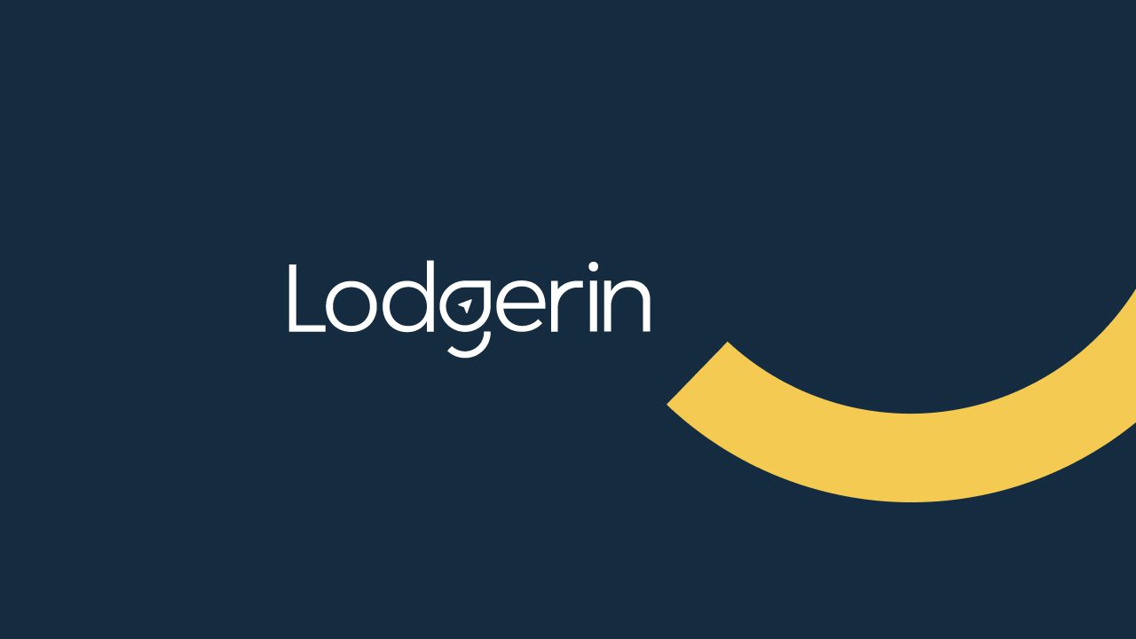
The design of our brand
When designing our new brand, we wanted to convey the feeling of constant support to the tenant, as well as our core values: transparency, communication and flexibility.
That is why our new brand has a key element: the smile that is drawn from the letter -g. From this smile we transmit closeness to our customers and show the enthusiasm of our team, who work every day to offer the best service.

In addition, we use different colors to differentiate our services for tenants and services for owners. Our tenant services are distinguished by the use of mustard yellow, while our homeowner services are identified by the color orange.


Our main goal is to make our clients comfortable and at ease, we take care of the rest. We know we still have a long way to go. But we are also sure that in this new stage we will achieve together everything we set out to do.
Because now more than ever, to be comfortable is to feel at home.
Take a look at our social networks so you don’t miss anything of this new beginning. You can contact us by sending us an email to info@lodgerin.com or through any social network, we are very nice people, we promise.
Remember that you can read other interesting posts in our blog:

No responses yet